Art help. Post your art
Hey everyone, I thought it would be cool to have a topic where we can all help each other on our art.
So the idea here is to post any artwork you have done, and we can critique them, do paintovers, give tips, etc... or just admire them. everyone is welcome! guess i'll start off. here is a quick and simple sketch that i did before posting this. (based on ととろ of course) 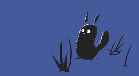 gonna use it for my avatar i think. |
awww it looks so cute ^^
k here's mine: http://i172.photobucket.com/albums/w...z/P4210238.jpg i'm still an amateur so..be gentle :) |
Quote:
A simple solution is to put some little flying beastie in that expanse - a butterfly, bee, or something similar (and small - you don't want it to dominate the picture). Ensure it is flying toward your critter, as that will bounce the viewer's eyes back to him again, creating a loop. Quote:
This particular shot would also work far better vertically. Rotate it right and see what I mean. It seems unnatural for things which should be looking up to actually be facing left. Keep it up! You've mastered one of the harder things, which is getting your subject in focus :) |
many many thx ^^
should i upload some more? |
Hey Ypsilanti
thanks for replying :) i really like your picture, like Troo said, your focus is spot on. the main problem I had with it is the actual flowers themselves. all that white stuff on the leaves isnt very attractive in my opinion... if thats what you were trying to capture though i would suggest a different angle which really shows the dirt on the leaves. I photoshopped your image a bit to show some things you could have done.  basic things like, color correction, playing with the curves etc... really help. also i removed some of the dirt on the leaves. I might have pushed the color a little too far thoughh... oops. anyways, good job, please post as many pictures as u'd like! :) |
Quote:
so thanks a lot for the comments, I thought my picture seemed kinda... dead and empty, so your comments really help. THANKS, i will post an updated version as soon as its done! you should post some stuff too! :) |
 all done on photoshop with a tablet... my poor tablet... (T-T) never let a chinchilla near tablet wires... This one's a pretty random pic... [img] http://c4.ac-images.myspacecdn.com/i...d2cf729683.jpg [/img] This one was first drawn on paper, scanned, outlined, and then colored on photoshop. This pic's one from a doujinshi I hope to make after I finish my current one :) ~(Both pics have been copyrighted)~ |
Quote:
Leave it as is and the picture tells a story and the viewer can't help but wonder what will happen next. It's perfect, don't change a thing. |
Second pic didn't show in last post... 2nd try--->
 |
Quote:
|
Quote:
OHEMGEE!! They were so pretty!! I liked the one with the red splatter with the streams coming out! Did you draw the lil fella in yer sig? He's so cute! <3 |
Quote:
No, I just edited it and whatnot. Here's the original: http://img.photobucket.com/albums/v9...g?t=1241045006 |
Quote:
and besides, i already added stuff to my picture before i saw your comment, haha  I did however try to keep some story to it, and i think i still have a little of that "what happens next?" in it. anyways, hope you guys like the finished product :) thanks again |
Quote:
|
Quote:
Like I said before, I love the simplicity of the first one, and I too see some talent ^_^ |
RKitagawa, Ypsilanti, InuAisu, and alanX, you're guys work is amazing. ^^v
|
@alan- i think the one with the smoke is the best^.^
|
Yeah I liked that one alot too and the monkey haha
|
whoah so many posts, gonna be hard keeping up with them all. alright, gonna start from InuAisu:
I love the dog! so cute lol the main problem with this one is your line of action, see how he's leaning to his right? kinda looks like hes gonna fall over. heres a quick sketch to show u what i mean.  u should always make sure the character is balanced unless its in the middle of an action, ie. running, jumping, etc... but since your character is simply standing, he should be balanced. keep up the good work though! would love to see more from you :) |
to MMM and alanX
thank you both very much, i see what you guys are saying, i still think it looks a bit empty in the first one, but I also see how the second one looses it's uhh... like....openness for the viewers imagination. wish i could find a happy in between. but oh well, i'm finished with that picture. i just thought it would be a waste to not upload version two after doing it. anyways, thanks :) |
ok next, alanX.
I really can't critique your stuff much, since it's mostly abstract. but man, you've got some really cool stuff. good job. I love the multicolored smoke. the only thing i'd say is to watch out for color, such as in... http://c3.ac-images.myspacecdn.com/i...feead9ca92.png that one, see how there is only one flat green for the grass, and a pretty flat grey-ish color for the sky? it could use more variation in my opinion. but that problem was only present in a few of your pictures, overall you have some crazy stuff. that apple is awesome. |
Great works guys. Really. Pretty cool stuff in this thread :)
I just started my first attempt at photoshopping a few pictures I drew for my friends, and I was hoping you guys could give a few tips to this ole' newb. These go in order from the first I phoroshopped, to the latest (I think they improve as they go): First: http://i40.photobucket.com/albums/e2.../ashcolor2.png Second: http://i40.photobucket.com/albums/e2...kriscolor1.png Third (alternate to the second): http://i40.photobucket.com/albums/e2...kriscolor2.png Fourth: http://i40.photobucket.com/albums/e2.../Krisbday1.png Any comments/criticism are welcome :) |
1 Attachment(s)
i want to know what you guys think of this rough draft. im making it for a contest. the deadlines july 1st so no rush for me. i am going to make the dress pink with either some teal or blue here and there. maybe even a dark pink. theres going to be stawberries behind her with pocky in big letters surrounding her. the dress is still pretty much incomplete. the eyes arent the way i want them so im redoing it .
|
PockyMePink
yay! chibi style... my.... favorite..... ok i lied, i hate most chibi stuff. but hey, whatever floats your boat. so, since i dont have too much time i'm gonna start with your faces/heads overall they aren't too bad, you're off to a good start, but since they ARE chibi it's kinda hard to critique... i mean... they're messed up anatomically, but on purpose... so even though it's wrong... at the same time it is right. BUT! even though the style is "super deformed" you still have to follow the basic rules. so, here's some pretty pictures i made for ya  so... in this picture, the guys head is tilted to his right. if we look at the eyeline though (blue line) his eyes go on an angle opposite to that. you should make a habit of drawing cross shaped lines across the center of the face. it will help to get the angles right. this however, was only on this one guy, all your other pictures were good with the eyelines. the overall problem you seem to have with the faces are the positions of the nose and mouth. and the size of your eyes. your eyes are.... HUGE, even for a chibi i think they're a little big. MOST IMPORTANTLY** the nose should be half way between the eyes and the chin! The mouth should be half way between the nose and the chin! practice these things and you should be drawing more anatomically correct faces in no time. as for the body, i can show you that next time. so, thats all i got for you at this moment, hope i helped a bit. if you have any questions i'd be glad to lend a hand. sorry if that all sounded a little harsh btw, just trying to help out. :) |
Quote:
The only thing slightly off to me is the eyes look a bit masculine. |
Quote:
|
Kyousuke
in all honesty, I really like it. I had a lot of trouble thinking of ways to improve it. biggest problem i have (which isnt even a very big problem) is her right arm. it looks nice, it seems correct to me. its just that since its coming straight out towards the camera, u really cant see much of the arm at all. so i was thinking maybe move it out a bit? up? down? just somewhere so that the silhouette would read better. Here is a paint over i drew:  but i'm not happy with the way the arm looks up there... i think to the side would be better. also... i dont know if this is just because of the clothes but she seems really flat chested lol or maybe she just is like that... i dont know. that one i'll leave up to you to decide. anyways I like it! good luck in the competition! please post some progress updates! i'd love to see the finished product. oh and, i agree about the eyes, should be more... round, and ... cute-sy-ish, ya know? :ywave: |
Quote:
This isn't porn tryouts:mtongue: |
Quote:
haha |
Quote:
i want to correct that arm because the long sleeves come off a bit weird, especially on the right arm. its a bit tilted but i plan to correct that when i sketch the final draft later. its because its for a drawing contest and the theme is pocky so i wanted her to hold a box of strawberry flavored pocky. i think i might raise the right arm up just a bit so you can see the arm. |
This was my one of my newest:  What I'm aware of: - Arm length - Weird right foot - Bad/lazy hands - Maybe the shoulders are weird looking at it~ Oh yeah and the Momoko speedpaint:  |
I WANT THAT KAMIKAZE GIRLS PICTURE! thats awesome
|
Quote:
|
1 Attachment(s)
I fixed the eyes and added more detail to the dress
|
Just trying to catch up on this thread this morning, so forgive me if I've left anyone out.
RKitagawa - Vastly improved, although your caterpillar should be a little further left. The image now draws the eye in rather than repelling it. AlanX - Sorry, our firewall blocks the server your images are hosted on, so I can't comment :( MissMisa - The face is angled incorrectly to sit naturally on the head. The head is facing to our left just a little (by the placement of her right cheek and left jawbone), yet her eyes, nose and mouth match the placement of a head facing to our right just a little. Kyousuke - That's coming along brilliantly! Can't wait to see the finished result :) For those of you seeking feedback on your artistic skills, I heartily reccommend the ImagineFX forum: ImagineFX - Forums They're an extremely helpful community, and it's not uncommon for artists posting there to be published in the magazine itself :) As for posting something of my own? Hmm. I tend to do portraits more than scenes in my drawings, and my photography is mostly animals. Here are a few:    |
More:
     |
|
Quote:
When shooting white subjects, take a shot with AWB, then set your white balance / colour temperature to the shot you just took. That way your whites don't get greyed or blued out. The camera has also underexposed the background due to the brightness of the flower. Bracketing could've helped you here again. Quote:
Remember, the trick with shooting flora is to get your hands in there and force it to look natural. Shooting things as they naturally are invariably leads to distractions and unwanted crud in the shot. Plants are great practice material because you can gently move them around to fit your purpose best. One of the best flower macro photographers I know lists clothespegs, elastic bands, sticks, and a water mister among his most important equipment :D |
Quote:
But I will agree that picture is a little off. It was a last minute drawing I did at the end of a test in chemistry class, so I don't really beat myself up for it like I usually would -_-; Thanks for your comments :) |
| All times are GMT. The time now is 04:16 PM. |