JapanForum.com  


返信
 
LinkBack スレッドツール
(#1 (permalink))
古い
ilikeyouclothing (オフライン)
New to JF
 
投稿: 6
加入日: Sep 2009
I am planning a japanese design... - 09-15-2009, 11:16 AM

Im am planning on a japanese design now actually

would you guys like to get a preview and let me know what you think?

its a cute style print.
引用を使って返信する
(#2 (permalink))
古い
JustinATTACKのアバター
JustinATTACK (オフライン)
Wtf does *glomps* mean??
 
投稿: 67
加入日: Aug 2009
場所: An Overly Arrogant Nation!
AIM経由でJustinATTACKにメッセージを送る
09-15-2009, 11:35 AM

I wouldn't mind seeing it..


"Know the smallest things and the biggest things, the shallowest things and the deepest things. As if it were a straight road mapped out on the ground ... These things cannot be explained in detail. From one thing, know ten thousand things. When you attain the Way of strategy there will not be one thing you cannot see. You must study hard." Miyamoto Musashi
引用を使って返信する
(#3 (permalink))
古い
ilikeyouclothing (オフライン)
New to JF
 
投稿: 6
加入日: Sep 2009
09-15-2009, 11:58 AM


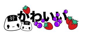
heres a small version of it, just to keep it easy to load

let me know what you think
it will be sold here I Like You Clothing — Home
Inspired by grave of the fireflies!

printed on girls underwear white with black trim and perhaps baseball t-shirts white with black sleeves?
引用を使って返信する
(#4 (permalink))
古い
GTJのアバター
GTJ (オフライン)
Defeater of Weaboos
 
投稿: 478
加入日: Jul 2009
場所: Osaka, Japan
スカイプ経由でGTJにメッセージを送る
09-15-2009, 12:19 PM

I say take the typography further. Look up some clips of Japanese variety shows on TV and you'll see that they go crazy with it. Part of the reason is because there are relatively few Japanese fonts (a result of no typographer wanting to make all those kanji), so they have to be as creative as they can. This means using stroke, fills, gradients, outer glows, inner glows, drop shadows, bevels, embossments, neon glows, cutouts, etc etc. Most of the techniques can be done with some creative thought and problem solving within Photoshop and Illustrator (more the former than the latter, though any good designer will tell you Photoshop is NOT for typography, this is the exception).

Anyway, the black, vanilla text just ain't doin it for me. Plus, are the onigiri crying? I've seen onigiri with beady eyes and little "3" kitty smiles like this a million times before, but not with the 好 up top, so that's a good element that sets you apart a little bit. Are the purple bits supposed to be grapes? Also, do you think you should add more depth to the strawberries? I would say tone down either the red or the green because right now they're kinda hard to look at.

As my professors always said, "keep going!"


光る物全て金ならず。
なんてしつけいいこいいけつしてんな。
引用を使って返信する
(#5 (permalink))
古い
ilikeyouclothing (オフライン)
New to JF
 
投稿: 6
加入日: Sep 2009
09-15-2009, 12:26 PM

okay (: thanks for the advice, i shall have a play with your suggestions and see what happens from there. The onigiri just have black blushes because to a a pink would mean 5 screen colours, being way more expesive for printing but i see what you mean, They do look strange to someone who doesnt know my intentions.

its nice to receive some feedback, thankyou

I appreciate it a lot
引用を使って返信する
(#6 (permalink))
古い
GTJのアバター
GTJ (オフライン)
Defeater of Weaboos
 
投稿: 478
加入日: Jul 2009
場所: Osaka, Japan
スカイプ経由でGTJにメッセージを送る
09-15-2009, 12:33 PM

引用:
最初の投稿者:ilikeyouclothing 投稿を見る
pink would mean 5 screen colours, being way more expesive for printing
You know what you COULD do... you could just get 2 spot colors, black and red, and that lets you use every gradation thereof. I did it once when I designed shirts for a university sports club on a budget; did a complex design but with only 2 colors and they gradated them (black to grey, etc). Turned out fantastic. See if your printer offers that! I may have forgotten what the process is called because it's been forever since I've worked with print, but it's worth looking into!


光る物全て金ならず。
なんてしつけいいこいいけつしてんな。
引用を使って返信する
(#7 (permalink))
古い
Columbineのアバター
Columbine (オフライン)
JF Old Timer
 
投稿: 336
加入日: Jun 2009
場所: United Kingdom
09-15-2009, 04:31 PM

Or tone the strawberries down to a pinker colour and reflect that in the blushes? Then you'd still have 4 colors.
引用を使って返信する
(#8 (permalink))
古い
GTJのアバター
GTJ (オフライン)
Defeater of Weaboos
 
投稿: 478
加入日: Jul 2009
場所: Osaka, Japan
スカイプ経由でGTJにメッセージを送る
09-15-2009, 04:39 PM

引用:
最初の投稿者:Columbine 投稿を見る
Or tone the strawberries down to a pinker colour and reflect that in the blushes? Then you'd still have 4 colors.
This idea is full of win!


光る物全て金ならず。
なんてしつけいいこいいけつしてんな。
引用を使って返信する
返信


スレッドツール

投稿ルール
新しいスレッドの投稿が不可能です。
返信の投稿が不可能です。
添付物の投稿が不可能です。
自分の投稿の編集が不可能です。

vBコードオンです。
スマイルオンです。
[IMG]コードがオンです。
HTMLコードがオフです。
Trackbacks are オン
Pingbacks are オン
Refbacks are オン


Copyright 2003-2006 Virtual Japan.
Search Engine Friendly URLs by vBSEO 3.0.0 RC6